“Walter Käch’s Lettering is cult classic design book whose ripple effects can be seen in some of the biggest brands of today.” — Fast Company
Images by Dinamo
Lettering: A Reprint of a Cult Classic
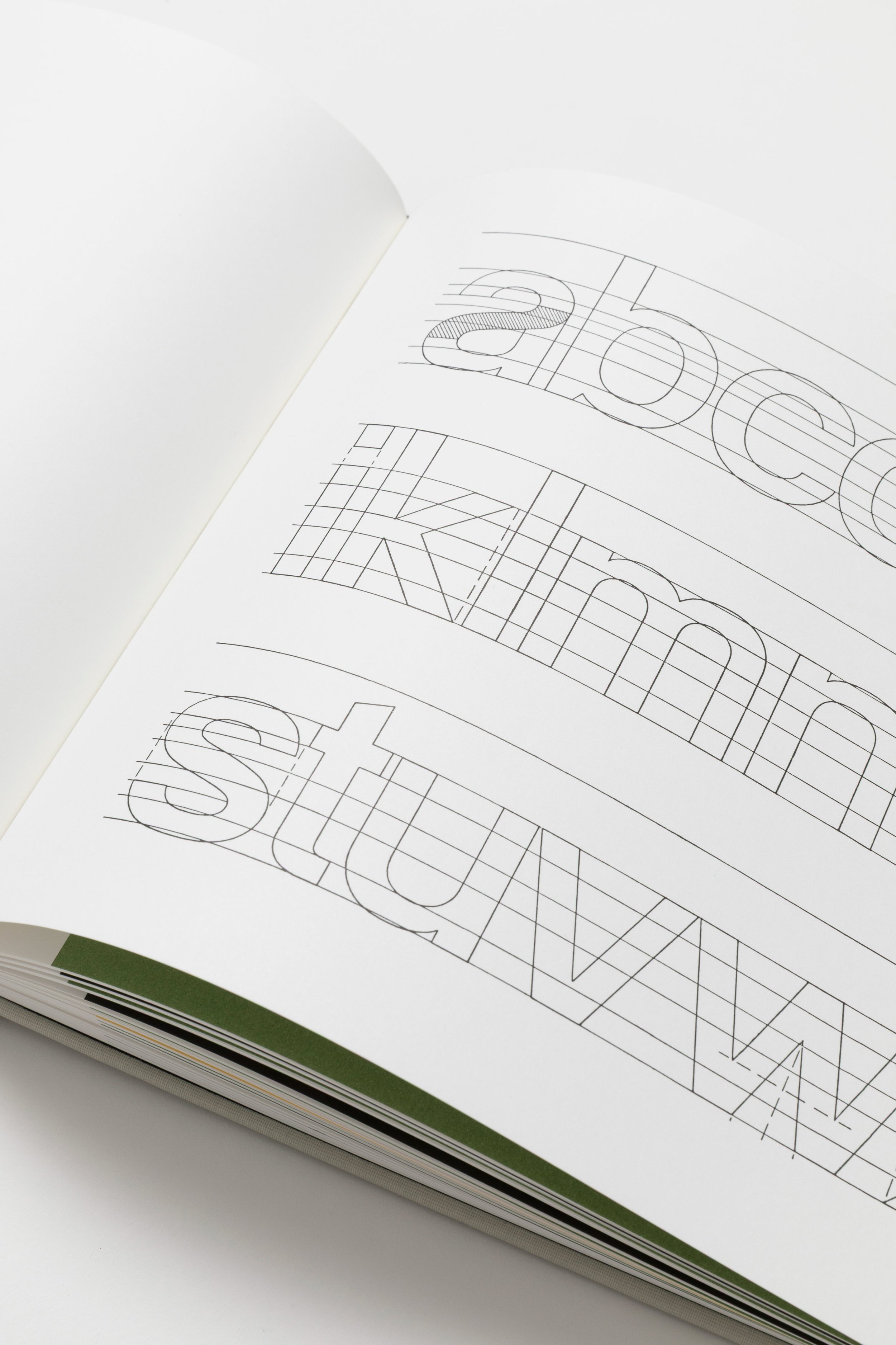
For decades, Walter Käch’s Lettering (1949) served as a vital handbook for practitioners and students of type design in Switzerland and beyond. Its lessons helped shape the distinctive forms and ethos of mid-century design, leading to the development of influential typefaces such as Univers and Helvetica. Until now, this historic type textbook has been notoriously out of print.
As part of my role as Head of Publishing for Dinamo Editions, I co-published a reprint of Lettering together with the Museum für Gestaltung Zürich. As editor, I also commissioned new historical essays translated into three languages and oversaw the book’s production with the design team omnigroup.
Käch was ahead of his time, and his suggestions remain relevant for our current age of Bezier curves and pixels. Today’s readers can learn by tracing: Käch taught designers how to look for elements in the construction of letters that could be modified and built upon, allowing for the smooth development of typeface families. One of the richest places to find these elements, for Käch, was the history of writing itself, and he encouraged his students to recycle past motifs to unlock new design potential.